Database Intelligence UI Design

Ph_Part_3.jpg

THE BRIEF 

Profiling your existing database intelligence gives you a full understanding of a company’s very first customer right up until today. Database Intelligence gives clients that insight in a format that helps you inform your marketing across all channels by cross-matching your customer data with our comprehensive market data algorithm, within a traditional data report medium.

The key aim, to deliver a fluid client experience that offered a multi-data approach using various forms of data to create an accurate picture of the client’s average customer. The system must set boundaries to cross-matching data sets but also deliver a powerful set of tools to encourage exploring and discovery.

IMG_0188.jpg
 

We were set the task of taking the already established Data intelligence model and create an interactive system to deliver the client’s customer data in a form that empowered clients.

Delivering all customers business analytics in one convenient app while cross-matching it with data intelligence’s data at their own will.

laptop-dark.jpg

PROBLEM

Early Dashboard wireframes that became too cluttered and unorganised.

Early Dashboard wireframes that became too cluttered and unorganised.

1) The infinite nature of data presented a problem with setting user expectations, in a perfect world you could take multiple sets of data and show them in a large graph for one data point such as product vs time. We realised early on that boundaries were needed to ensure the data displayed was understood and key data was represented clearly with out empty graphs or irrelevant data on show. 

Data classification models to keep search boundaries in place

Data classification models to keep search boundaries in place

2) Another key challenge was to create an overview dashboard, a place where the clients could customise and obtain a big-picture view of there data and understand how the company was growing in the key areas relevant to the business’s KPI’s. 

3) Designing a fluid system that leverages all data variables including Time, Location, Sales amount while cross-referencing DB intelligence’s data with the clients data to deliver key market insights about their customer base.    

Dashboard View

Dashboard View

SOLUTION

iPhone X-X5555S – 1.jpg

1) A data filter system was implemented to combat the issue of managing the cross-referencing of filtered searches. Up to 5 data profiles could be set at one time within the system viewport showing each profile as its own series within the set graphs.

The key variables for each data profile can be set in the filters menu, offering a high level of analysis while managing the viewable data to create a dynamic user experience drills down into the specific customer data and behaviour you are looking to explore. 

Each data profile can be viewed individually or crossmatched allowing exploration of data to take place. This will make understanding business performance effortless while giving the user the freedom to discover hidden wisdom within past sales data. 

window design.jpg

2) The Customizable window design can be customized uniquely to every individual user using workspaces to leverage data analytics for every role the user assumes. The system will determine what can be shown based on their customer data provided to the onboarding team, meaning empty graphs or empty windows are non-existent. A new window can be added at any time from the customer data available and will show cross-referenced data when more than one data profiles are selected in the filters bar.   


Filter Panel: Set filters for each data preset effortlessly.

Filter Panel: Set filters for each data preset effortlessly.

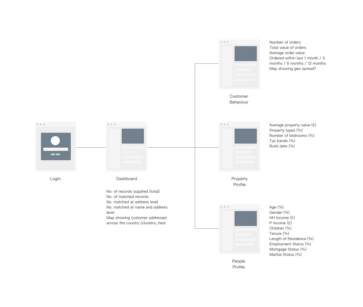
3) We simplified the data views by focusing on three main channels users could view their data, the dashboard, a map view and specific grouped data ( which consisted of people data, property data and customer behaviour).

The map view fused with the power of the filter system gives users the ability to showcase data for presentations levering geographical sales hotspots. Used correctly this can unlock untapped parts of the country where marketing efforts can be deployed. 

a fluid graph and map experience was CREATED in presentations and meeting to support your stats.

Giving the user the ability to switch between data sets and search results with speed during meetings to maximise the key findings. The power to see sales, customers, logistical locations ( including depot, advertising, and production locations delivers a key tool for identifying underperforming areas and opportunities for new marketing strategies

 
Map View_Screen Mockup .jpg
Ph_Part_3-Recovered11.jpg


Homesearch UI & Web Design

01-Recovered.jpg

BRIEF

Homesearch delivers comprehensive information on every single property in the UK to Estate agents and property investors, helping them sell and let with confidence.

A new brand strategy demanded a new webspace that set a branding style in place and explained the key ways in which home search can help the property community. 

An emphasise on the tools on offer and how each section of the platform can be used to increase house sales and support agency owners was key to make the website a strong asset for the home search sales and marketing team.

 
HS_web mockups.jpg
 

 PROBLEM

The biggest challenge was ensuring the complexity of home search property data wouldn’t make it easy for users to overlook the range of data on offer and how home search is unique compared to other property portals.

 
Screen Shot 2019-11-18 at 11.41.43.png
Screen Shot 2019-11-18 at 11.42.12.png
 

The site needed an aggressive signup procedure more aligned with new-age platforms and apps versus traditional property portals. It was evident that once a user experienced the key tools the majority of users would understand the value of the platform, it was imperative to get potential customers to commit to the platform to gain access to home search. 

The core value of the platform comes from the data and how it is fused with a user-friendly system, Homesearch is so much more than another property portal to search for houses, this needed to be clearly conveyed in the branding.

 
web mockups3.jpg

SOLUTION

By integrating the main signup field into the main homepage header this utilised a direct marketing approach. Suggesting business names based on homesearch’s database of top estate agency’s, this would boost social proof to build upon the reputation built up through word of mouth. 

The integrated header signup field utilised a direct marketing approach leveraging social proof to encourage user commitment
macbook pro - touchbar - Mockups - vol18 - D.jpg
 
Screen+Shot+2019-10-29+at+11.39.30.jpg

Every page is designed to inform the user on the power of the platform and the tenacious tools on offer to grow the user’s agency and house sales, call to actions were intentionally place on each page to effortlessly lead the user to book a demo or signing up no matter what page they click on. 


The single line illustration APPROACH was chosen to convey a clean app Style

Slick line illustrations and vibrant colour pallet support data driven values while setting the site apart from other established property portals.


web+mockups2.jpg

Environment Agency Map Design

The Brief 

The Environment Agency was ready to update their Medway river map design. The new design was to help tourist and river users down the watercourse while providing useful information with modern styling. The challenge here was to convey the vast amounts of information while keeping the map clear and navigable.

solution

Muted colors were used for the backgrounds and primary colors for important points on the map. Also, a new key system improved the clarity.

By merging two sources of maps from their previous documentation we were able to create a map that covered all key areas for walkers and boaters, including facility icons and bridge height illustrations.

environmentagency2-copy.jpg

result

This project resulted in a map that was well received by the local river community, allowing the Environment agency to update their brand identity and be seen as an evolving agency.


1790 Ventures Brand Identity

the brief

1790 Ventures is an investment firm that pushes boundaries of the traditional firm by investing in innovative startups that are sculpting the future. Their business approach demanded a brand that spoke to traditional investors while boldly showing what their company stand for and hope to build.

We worked with 1790 Ventures to create a brand and pitch deck that resembled innovation, integrity and development.

Solution 

The focus on bold imagery and modern iconography pallet enabled us to create a brand that speaks to traditional investors while pushing design trends. By choosing abstract imagery the identity creates an authentic and bold aesthetic.

The simplicity of the graph styles and formatting delivers important information in a fresh and absorbable manner.

Result

By the end of the project, the branding achieved everything we discussed in the brief. Decisions made early on enabled JWDesign to hone its skills to deliver a brand & deck that did not alienate the two main demographics that 1790 Ventures deal with on a daily basis.

1790 Ventures have continued to grow their reach and invest in many exciting projects since the new brand was established.

Dangle

slidedeck--Danglev8_Artboard-1.jpg

The Brief 

Dangle is a fresh journey startup that uses technology fused collectable jewelry products. These products come with encrypted chat rooms to create fun social experiences. Dangle was built for the young female demographic, allowing their social group to choose, collect and connect through private chat rooms.

Dangle demanded a vibrant colour scheme and visuals that showed the potential of targeting the young female market. This was an essential part of the presentation and branding brief, which would allow dangle to draw the attention of potential investors and a new CFO.

Solution

By using vibrant colours on a white background for the app icon we still maintained a clean style while injecting the fun persona needed for a young jewelry product. We dialed down the messaging to create a simple and digestible narrative, ensuring the core features of the product/concept were understood.

Result

The pitch and brand design were a success and JWDesign continued to support the Dangle team during their marketing strategy. Dangle went on to find a CFO and start their seed round.